So much of our decision-making process depends on perception. Our perception of quality, aesthetic, and value is guided by the presentation and design of the products we consume, activities we take part in, and so much more. We engage in this valuation process on many levels, but often the most effective component of our decision-making lies with design.
Especially now, when our attention spans have grown accustomed to the constant of information and media thanks to Facebook, Twitter, and Google, our brains have become more focused on deciphering these messages and targeting only the most effective communications. The message can come through many channels (brandmark/logo, typography, web design, product engineering, applictions, etc), but we see time and again that good design matters. It captures our attention effectively, makes us feel at ease, conveys value… the list goes on. We see this in product studies where shopper activity is monitored in a grocery store through retina-tracking, and more often than not, our decisions have nothing to do with a sale, or where an item is positioned on a shelf, but by how that product looks, and is presented.
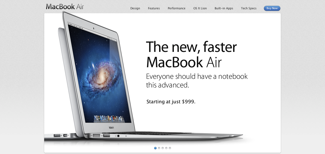
No company is more effective in this presentation war than Apple. Steve Jobs and Jonny Ive were/are masters of perception. The images here are not only a test to that, but to the hesitance (in varying degree) of their competitors to realize the effectiveness of their messaging and functional design.
Dell seems to have caught on the most, but is still mired in the apparent need to show absolutely everything they feel the need to show at one time.
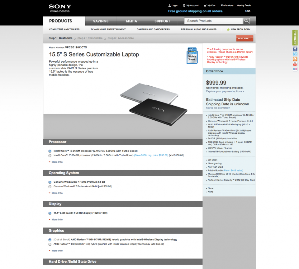
Sony hes a bit of the same information-itis, yet displays it in a yet-even-more-bland manner.
HP is the worst offender. Despite the fact that the price of their products are often half those of Apple, there is so much disorganized, irrelevant information on the page that the user loses sight of what it was they came to the page to see in the first place… Their priorities are so different than those of Apple, though. There is clearly a lack of emphasis placed on the product. They are more concerned with urging someone to buy in desperate fashion, through a red sale price and “buy” buttons.
So the question I would ask you is, is it important to convey the things that you care about with beauty? Apple clearly takes pride and care in their products, and attempts to convey them with beauty, which the user perceives as value. Good design matters… it tells a story, conveys beauty and value, and reflects a sense of pride in the message that is being conveyed.


